CASE STUDY: Logo/Brand Design Update – Burns Stainless
I use a proven process when developing any design. I am a firm believer that design must be more than a subjective “looks good” but must also work well. In logo or brand design this is highly critical in developing brand engagement. The process goes like this…
Creative Brief
I discuss with the client the type of business, their positioning within the industry and who their target audience would be. It is best to get as specific as possible. Having a specific target will help in reaching that target effectively. Create a persona, a sample of that type of person. The design process will help us to discover how that person reacts to specific colors, design and typography.
When working with an individual, this brief will take place in a conversation, when working with a team I create a written brief so everyone is on board with the intended outcome.
Creative Process
In this case the process was to update the design by increasing readability, refreshing the overall design. I went with the theme of PERFORMANCE to create a design that shows motion, and innovation.
Revisions
From the initial theme presentation I usually work within two rounds of revisions to come up with the final design(s) and brand specifications of color call-outs, typography, proper and improper logo usage.
Design Process:
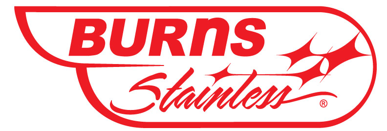
The original design with its “double bubble” shape was created from the original owner who thought (correctly I will add) that “people remember a unique shape”. The bold lettering juxtaposed with the script “stainless” are a nice combination to show the variety in the products and services they provided. To show depth the original designer used a stepped drop shadow which looks great up close but readability starts to fade as the logo is smaller and needs alteration when laser etched onto the products.
First Rendition: The first challenge was to find a script font that was much more readable with cleaner lines. The client preferred to keep the original S so it was a factor in the choices made in font. I found it in Sarah Script Regular, but had to alter it by skewing to the right about 9° to match the slant of the S.
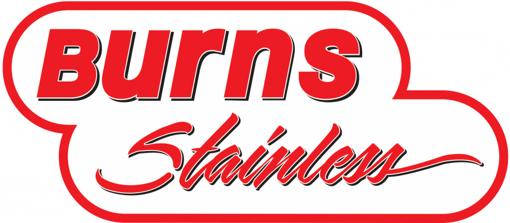
Next Step: We ran with that version for a bit before moving into a full-blown brand update campaign. Here we got rid of the drop shadows as they did nothing to emulate the brand. We opened up the letterspacing of BURNS and made all upper case except for the n which worked better as a visual representation of their product of stainless steel tubing. The capital N was just too harsh of angles for this representation.
Then we updated the shape adding movement with a wing type shape to show performance. Even the line weight changes slightly to emphasize movement. That left us with a significant space which was perfect to add a diamond design to reflect Burns Stainless’ new “Diamond Standard” mission and the style of diamonds represent the explosion that their exhaust products thrive in.
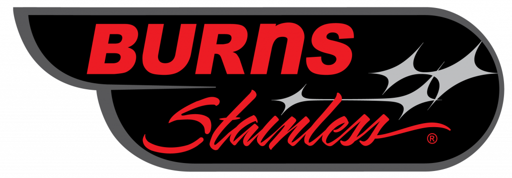
ALTERNATE VERSIONS – It is imperative that a brand design has some flexibility especially for different uses. I found it important to design a logo in one color first. It must work in one-color in order to work in full color. This design is proof of that fact. Also when using the design as a watermark in images and laser etched on the product is just as valuable. A dark version was also created for use on approapriate stages.
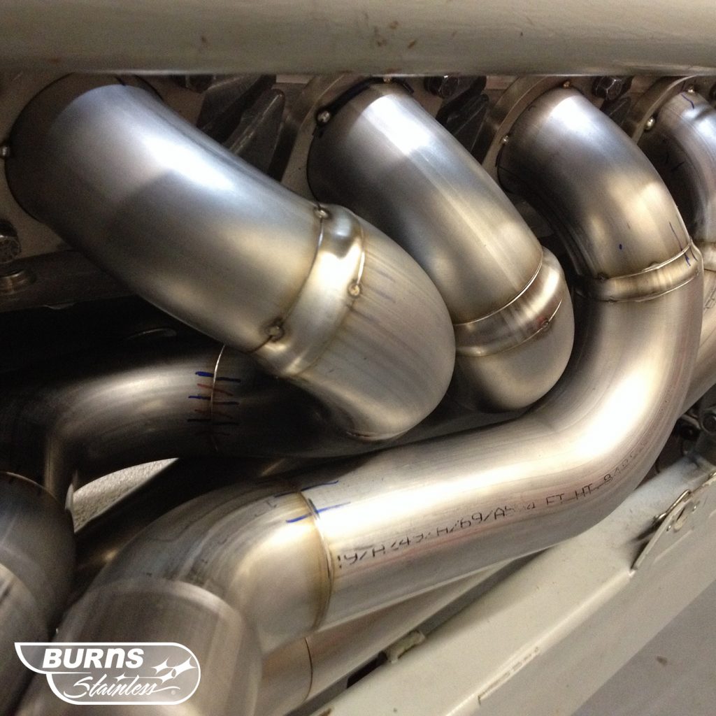
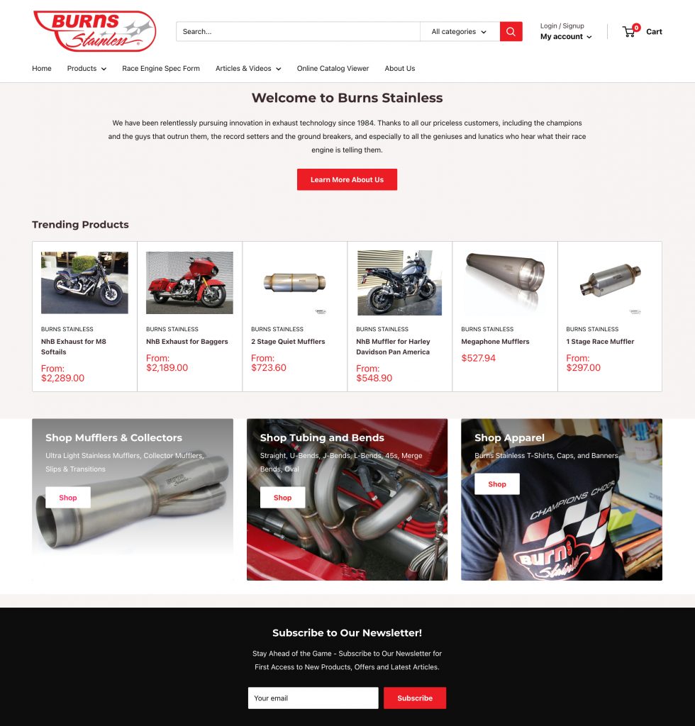
IN USE: Here are some samples of the mark in use: