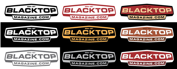
I’m asked quite regularly if I design logos. At first I have to ask what’s the logo for? There are many different answers to this. A logo can be a t-shirt design, a company mark, a button for a website, etc. In this case, let’s discuss the company mark.
A logo is much more than your initials in an interesting font. In-fact, it shouldn’t be a font at all. A logo must be unique. Many people don’t know this but you can’t trademark your logo if it is simply typed out in a font. It has to have some unique characteristic. Best if it can tell a bit of a story about the services or the products you produce.
Logo Design vs. Brand Design
When asked to make a logo for a company, I will pursue the use of the design. The logo must be versatile, yet have a level of consistency. As Brand Design, we approach a logo design as not one element, but a series of pallets. There’s a typographic pallet, a color pallet and imagery/use pallet. This pallet approach allows the user to keep consistency in design and versatility in use.
It must be able to be effective in a variety of ways. Effective. Now that’s a term not usually associated with logo design. I’ve seen over and over again, logos, which are hard to read. Either the colors are too similar in value and details get washed, or from a distance thin lines (which may look good onscreen) get lost on a t-shirt or on a billboard. The design must be clear to read and better yet, understand. When reviewing, look for design elements which may hinder the legibility. Are there lines running through the type making it difficult to read? What about the background? What’s behind the design that can make it difficult to understand?
The logo must communicate. That is primary. Proper use of design elements such as type, color, texture, patterns etc. all contribute to the communication level of the design. Even if the logo is simply one letter, the style and color should at least hint at what the company stands for. HOWEVER, be careful of being trite. Don’t go for the obvious. We’ve all seen the logos that do that. My first thought is Apple. Their logo is clear yet not silly. Have you seen your neighborhood companies that use Apple as their name? Apple cleaners, electrical service, etc. Always with a big shiney red apple that doesn’t say a dang thing about their company.
So let’s sum it up. A logo must carry these three main elements:
1) Versatility and Consistency
2) Clarity and Legibility
3) Proper Communication of the Brand
If you’d like more detail and possibly an objective look at your brand design please don’t hesitate to call.

